Project Archive
Our clients range in industry, size and complexity. Here’s a selection of projects from the archive.
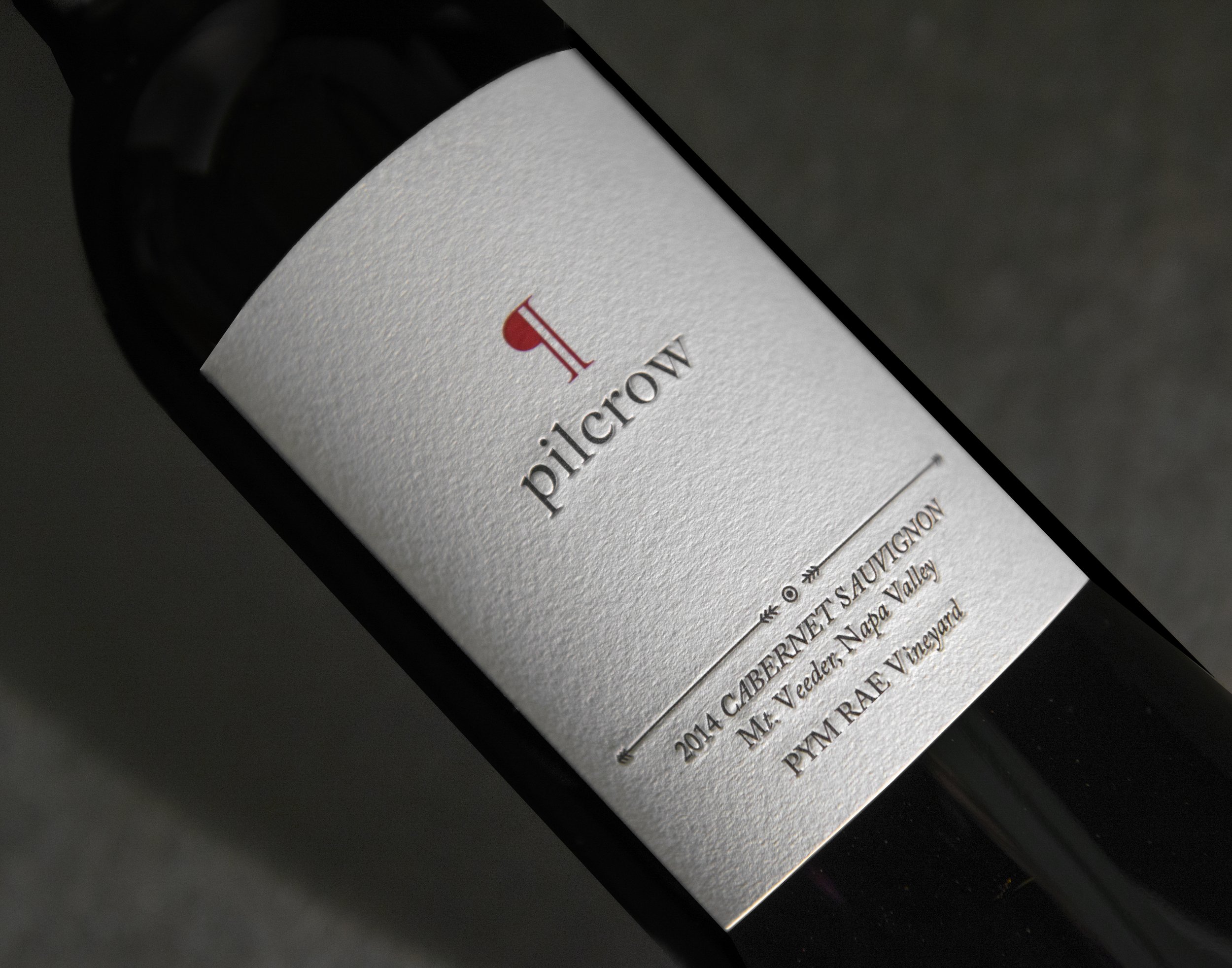
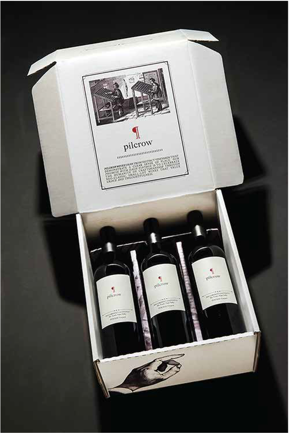
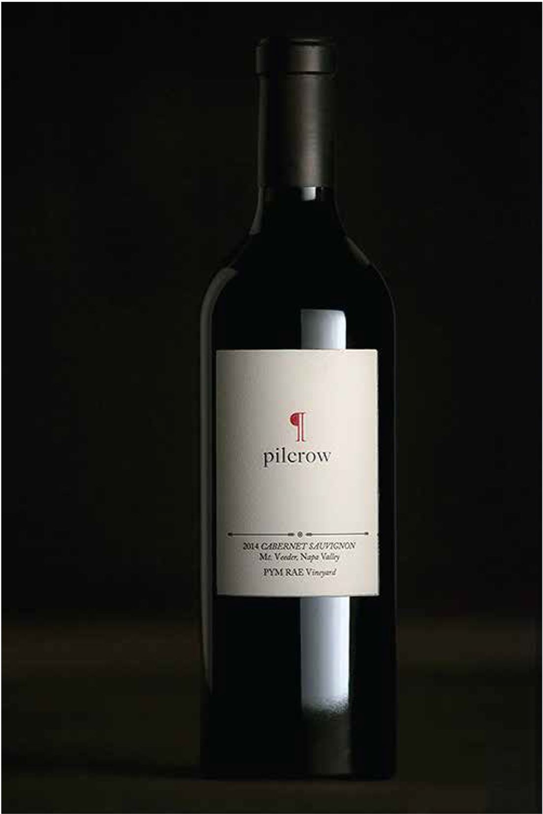
Pilcrow
Brand Launch
-
The idea for Pilcrow was born from two Vintners, their mission to bring back a classic Napa Cabernet style and their ethos of handicraft.
-
We crafted the logo in the style of the pilcrow symbol, and designed the label and packaging to evoke the handicraft spirit of the brand. Texture, story, symbolism come together to reflect a return to a classic style and uncompromising quality.
-
Pilcrow launched to great fanfare. It quickly established a cult following and today is recognized as one of the top Napa Valley Cabernet producers.
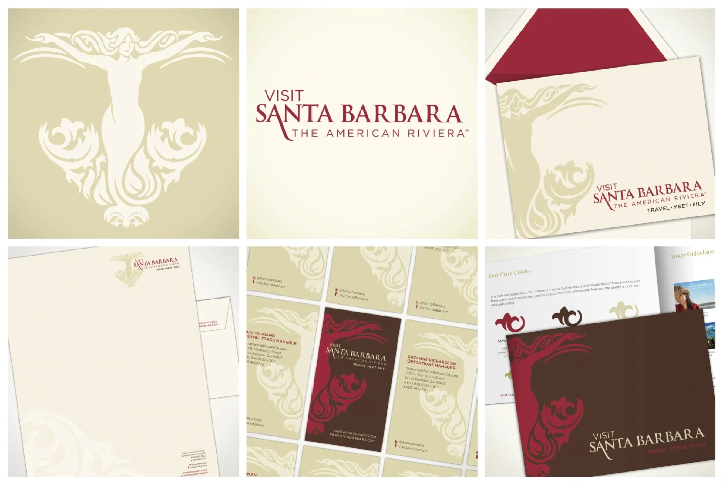
Visit Santa Barbara
Brand Evolution
-
Santa Barbara is a romantic California Coastal community. As a travel destination, their name and identity had become difficult to understand and outdated in style. In anticipation of adopting a new name, Santa Barbara Conference & Visitors Bureau and Film Commission sought to reinvigorate their brand identity.
-
Our inspiration for meeting this challenge came from our visual research of Santa Barbara itself – mission architecture, wrought iron, local signage, and even gardens, flowers and palms. We sought to build on the organizational strategy and the defined attributes – passionate, approachable, collaborative and strategic.
Drawing on these influences and the new name, we implemented a visual strategy to simplify and modernize. The result was both practical and creative– a logo that incorporates the new name, is flexible and works with various lines of business and a visual representation that stands out and gets noticed.
-
The result is contemporary brand identity that evokes the meaning of Santa Barbara and is unique in the California market. The new identity was then extended across Visit Santa Barbara’s advertising, website, collateral and promotions throughout the country.
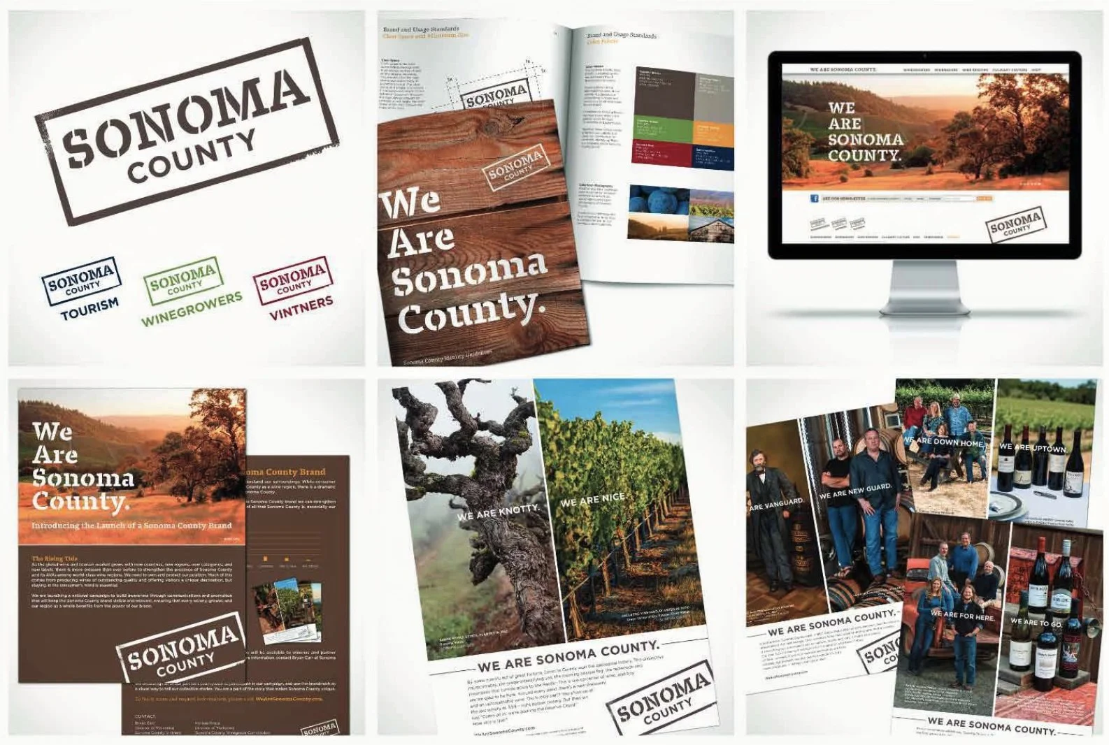
Sonoma County
Becoming a world-class brand
-
Research revealed low awareness and confusion in the market—many wine consumers and tourists believed Sonoma County was part of Napa. The challenge was a longterm one—establish a clear, differentiated position to define Sonoma County as a distinct, world-class wine region while aligning local stakeholders to work together.
-
We positioned Sonoma County around its unique strengths—sustainability, family farms, and diverse experiences—then built a comprehensive brand and communications platform to bring it to life.
Working in close partnership with Tourism, Vintners, and Winegrowers, we defined five core attributes and developed an integrated strategy to engage both consumers and trade. This included national campaigns, co-op advertising, the region’s first online Wine Finder, and a reimagined presentation series—creating a consistent and scalable brand system.
-
Sonoma County transformed to a recognized, world-class wine region. Brand alignment across key stakeholders strengthened visibility, increased national awareness, and contributed to measurable growth in both wine sales and visitation.